Barrett SF became Barrett Hofherr, and they needed a new brand! A brand that’s memorable, engaging and personal, like their work. A brand that’s creative, diverse and efficient, like they are. A brand that works well with others, like they do. They needed a flexible system with lots of personality and a new website to elevate their already wonderful work.
It was an honor to work closely with Barrett, Hofherr and all the partners, unifying their vision and creating their brand. I led the project, crafted the system and helped bring it to life in every touchpoint, including entirely redesigning their website. My favorite project to date!
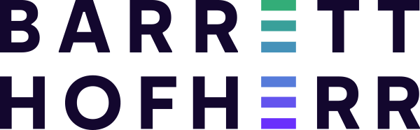
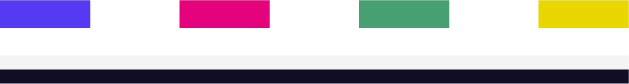
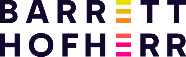

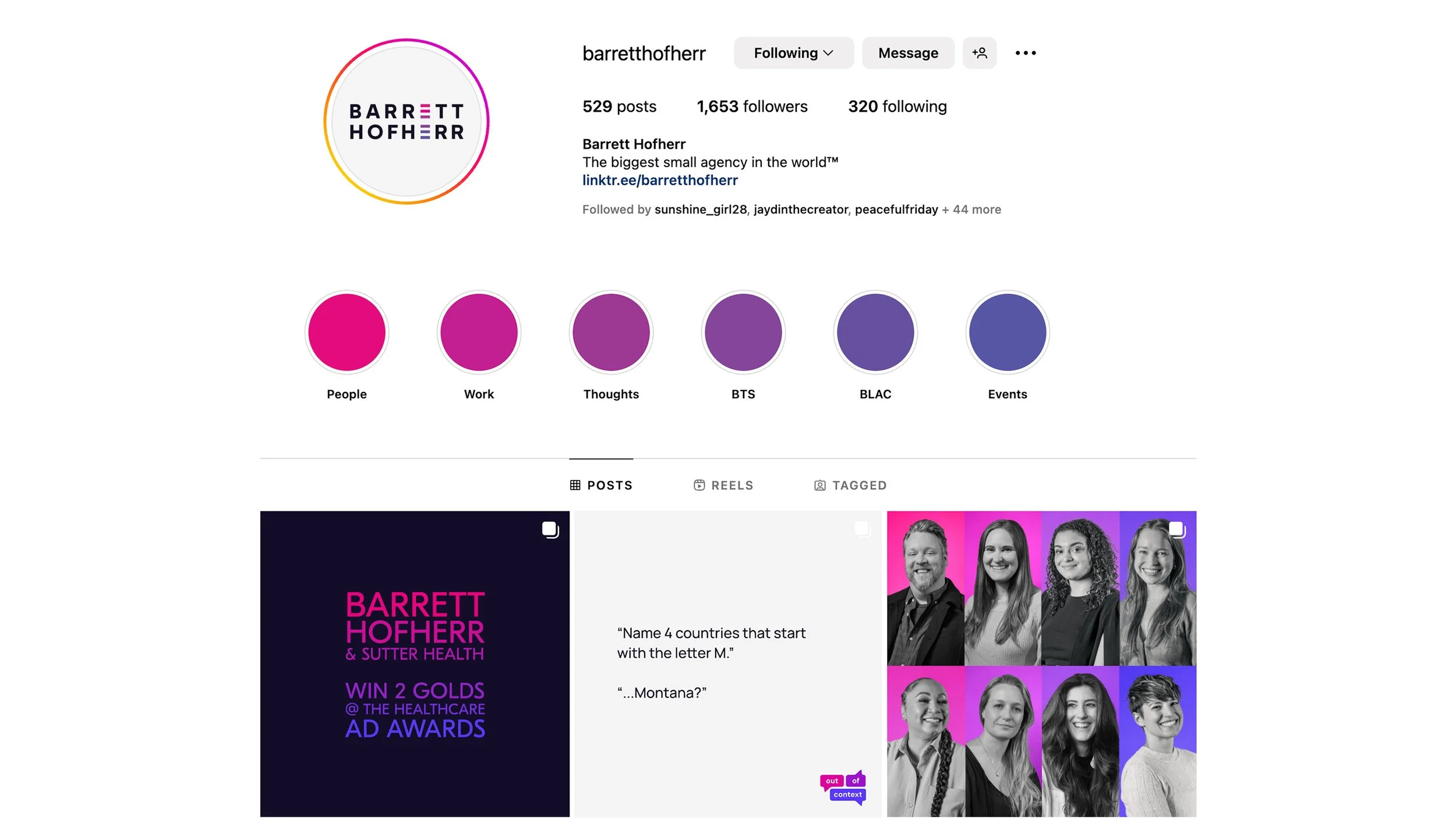
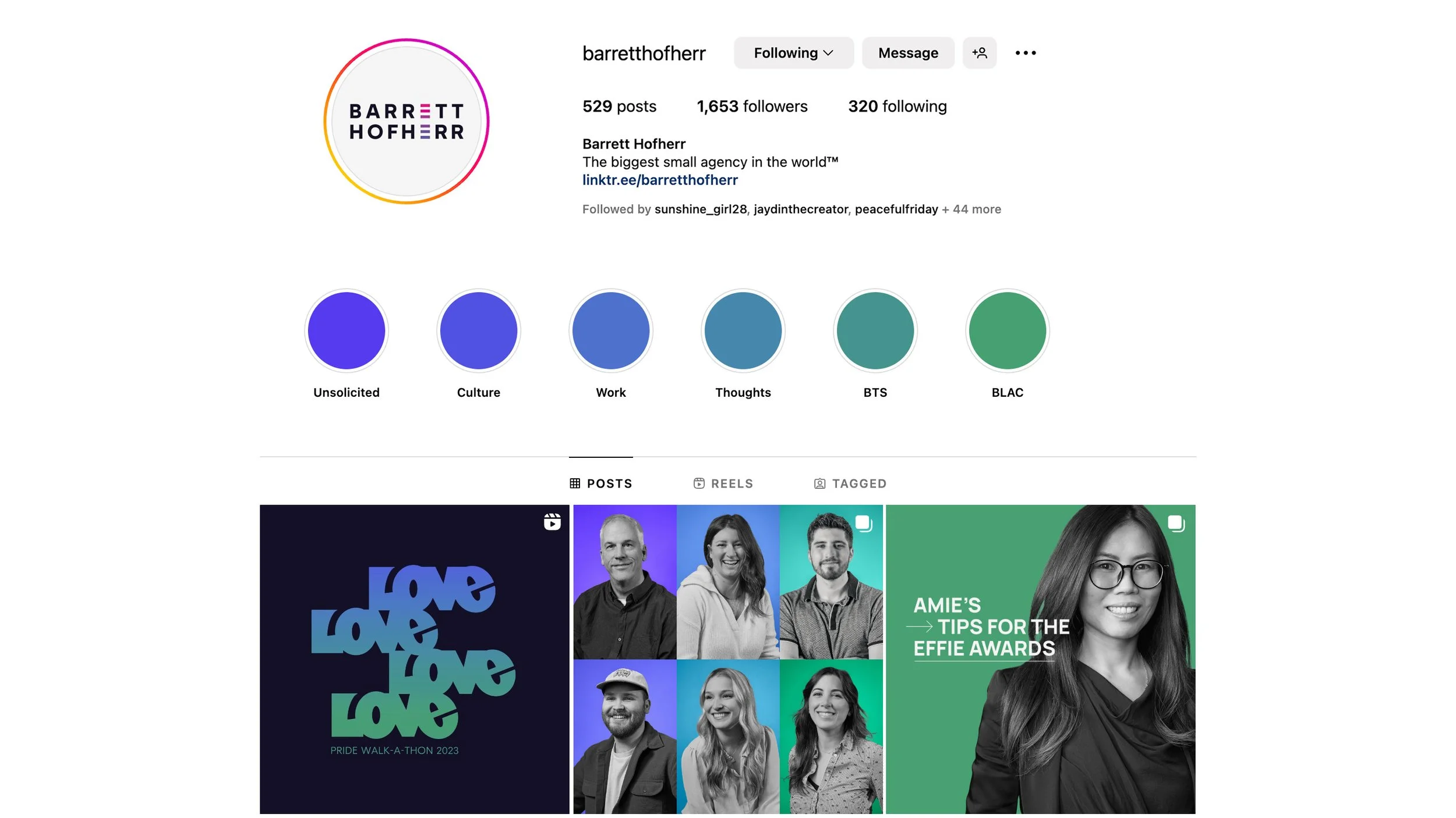
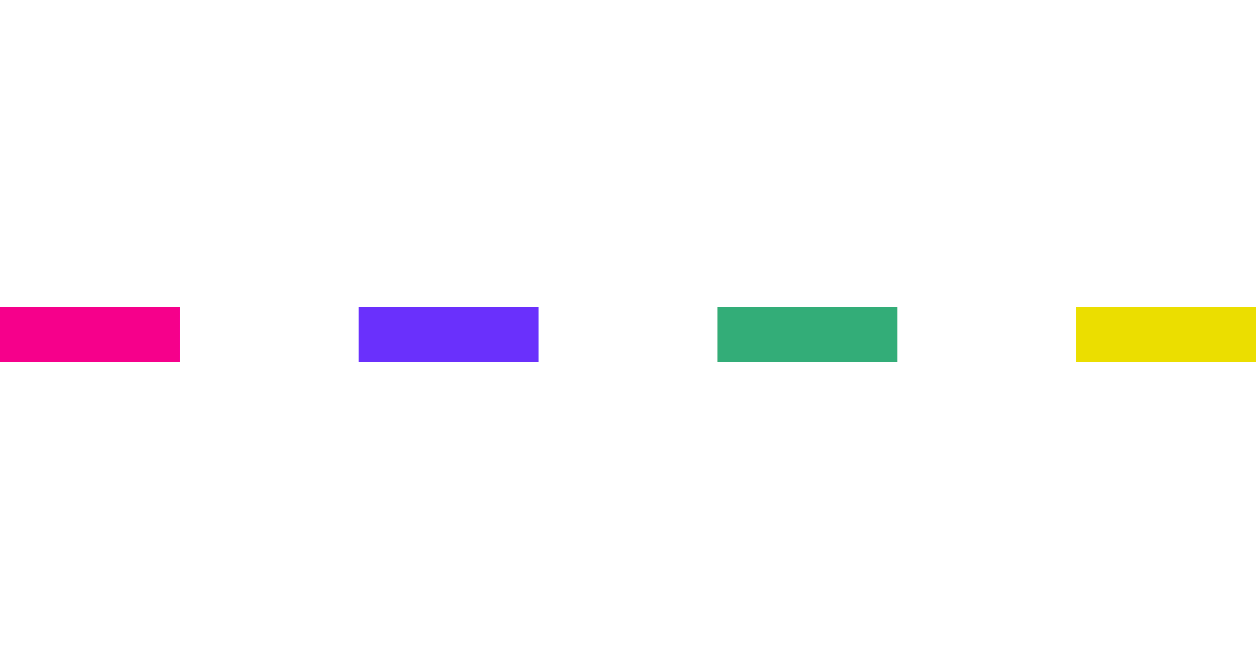
The colors needed to be bold and bright, energizing. They fit in a nice spectrum but we divided them into 4 stacks to be used independently. With a spectrum of 20 colors plus a palette with 6 grays, there was a chance that things could get very messy, very quickly. That’s when a good system is pure gold.


Ah! The joy of working with a font from Grilli Type! Eesti Display is perfect for this brand: great personality (look at that M, that G, and that S!) and great technical traits for a versatile brand (super legible with the tall x-height, great texture balancing the white space, geometric and clean but with enough detail to feel human. Perfectly crafted).
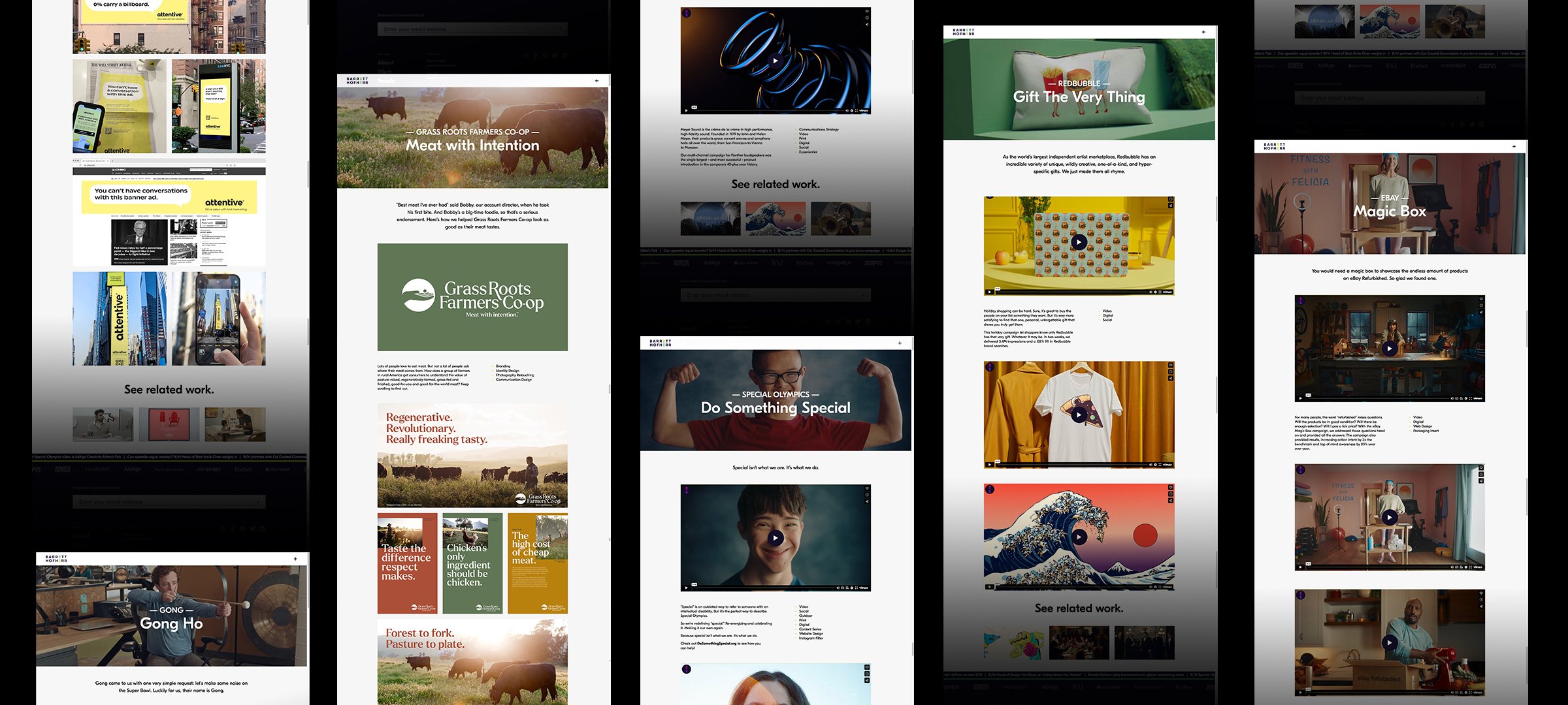
The website is one of the most important assets for the agency and I was able to prioritize information and create the wireframe to always put the user experience in the center of all decision making. The brand system came to life using a varied, yet cohesive, color palette that was tastefully applied to each page.
The home page gives a snapshot of the whole agency in a few seconds: you can get a good sense of who they are, the work they do and what they stand for. Each of the other pages were curated to share a true view of what’s like to work with them, the people, philosophy, capabilities, and more importantly, the work.

For the work page, I was able to switch their approach from a catalog of every project to a well curated gallery. So much thought and dedication goes into every campaign, it’s only fair to share the insight, the process and the depth and reach of every project.
We partnered with the lovely folks at All Kinds , and it was awesome to hear from the developer that he actually enjoyed automating our color spectrum system, applying the color stacks to the key elements of each page.
The biggest win was seeing the whole team embracing the new brand!